Picture for front page article
 Mind
28 Oct 2009
Mind
28 Oct 2009
Hello fellow artists. Just wanted to get your opinion on this graphic for a potential front page article about the community supplement design project. Is it ok? Looks stupid? Needs some work? Feel free to take the concept and run with it. I encourage any art team members to create a better graphic, or alter this one in some way. I do have some different capsule pictures, if the current highlighted capsule needs replacing.
Attached Files
-
 Front_Pill1.jpg 82.35KB
25 downloads
Front_Pill1.jpg 82.35KB
25 downloads
 lunarsolarpower
29 Oct 2009
lunarsolarpower
29 Oct 2009
Hello fellow artists. Just wanted to get your opinion on this graphic for a potential front page article about the community supplement design project. Is it ok? Looks stupid? Needs some work? Feel free to take the concept and run with it. I encourage any art team members to create a better graphic, or alter this one in some way. I do have some different capsule pictures, if the current highlighted capsule needs replacing.
The only thing I really like about the changes I made is applying the black to transparent fill over the background. I'd like to make it an image of a pill coming together from multiple parts - like a diagram of fusion taking place. Ideally I would use some kind of particle effects to make it look like something from a movie. If you want to send me just the background image I'm happy to apply the gradient effect to it if you want to go for something more complicated.
It's funny too, I didn't intend to put a white border around the text, it just happened with the method I used to select it out I suppose.
Attached Files
-
Front_Pill5.jpg 28.41KB
22 downloads
Mind
29 Oct 2009
I was hoping to put a colored transparent fill over the background, but I couldn't figure out how with my ancient graphics program. Anyway, I like the effect of it. I will send you the background image. The white around the text looks a little pixelated, could be changed or improved. Thanks for helping out.
 ajnast4r
29 Oct 2009
ajnast4r
29 Oct 2009
looks good... i would change a few things though, more towards the color gradation scheme lunarsolarpower presented. the glow around the letters should be a little sharper as well.
if you email me the base images, i can play with them in photoshop if youde like... ajnast4r@gmail.com
if you email me the base images, i can play with them in photoshop if youde like... ajnast4r@gmail.com
ajnast4r
30 Oct 2009
too artsy fartsy? are you trying to keep with a specific color scheme?
Attached Files
-
creating.jpg 48.38KB
16 downloads
Mind
30 Oct 2009
Not too artsy, however, I am partial to the capsule theme from the 1st two examples. I like the text form and color on your example. Also, the image needs to be 519 X 202 pixels in order to fit on the front page.
ajnast4r
30 Oct 2009
heres some for now... ill do more tomorrow 
Attached Files
-
creating2.jpg 41.11KB
15 downloads
-
perfect2.jpg 46.6KB
14 downloads
 JediMasterLucia
30 Oct 2009
JediMasterLucia
30 Oct 2009
@ Mind: could you send me the original pics you used? Then I can try it too. :-)
ajnast4r
30 Oct 2009
@ Mind: could you send me the original pics you used? Then I can try it too. :-)
attached
Attached Files
-
single_cyber_pill.jpg 661.72KB
15 downloads
-
single_colored_pill.jpg 70.89KB
8 downloads
-
 blank_pills.png 332.83KB
12 downloads
blank_pills.png 332.83KB
12 downloads
lunarsolarpower
30 Oct 2009
I was hoping to put a colored transparent fill over the background, but I couldn't figure out how with my ancient graphics program.
Mind and others, I highly recommend downloading and learning to use The GIMP. I'm pretty sure you also have to install this thing called GTK+ with it but it is amazingly powerful. It's really the only modern raster graphics program I've used and I was helping a guy use Photoshop a couple days ago and it seemed like GIMP had everything he was using.
The best part about learning a totally free program like this is if you ever go somewhere they don't have it you can simply download it and get to work. Additionally we could swap raw .xcf files before outputting jpg, gif or png final files.
JediMasterLucia
30 Oct 2009
thanks@ Mind: could you send me the original pics you used? Then I can try it too. :-)
attached

JediMasterLucia
30 Oct 2009
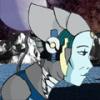
I faded the background of this picture so you can see the metallic pill better.
banner.jpg 71.47KB
16 downloads
and one with a other font:
banner2.jpg 86.56KB
16 downloads
banner.jpg 71.47KB
16 downloadsand one with a other font:
banner2.jpg 86.56KB
16 downloads
 Shannon Vyff
31 Oct 2009
Shannon Vyff
31 Oct 2009
I like the bottom one of JediMasterLucia's best The capsule design is very slick and futurist looking, the colors in line with our colors. The word choice is excellent.
The capsule design is very slick and futurist looking, the colors in line with our colors. The word choice is excellent.
Mind
03 Nov 2009
Yes, GIMP is the open source "photoshop". I have used it a bit in the past but have not yet become very proficient.
Thanks for the efforts everyone. Hard to choose, but might go with JML's. Maybe we can rotate them as well.
Thanks for the efforts everyone. Hard to choose, but might go with JML's. Maybe we can rotate them as well.
Mind
22 Mar 2010
Now that the community supp is getting closer to its commercial phase, we can no longer use the old slick/futuristic pill image - that one was only free to use for non-commercial purposes. For the label that goes on the bottle, we could use some theme ideas. This will eventually have to be coordinated with Anthony at Revg. Just fishing for some potential themes or images, something that is created in house so that there are no copyright restrictions.
Mind
06 Apr 2010
Last call for any ideas on the community supplement label. If no one has anything prepared, then Revgenetics will take care of it.


