• Log in with Facebook Log in with Twitter Log In with Google      Sign In    
  • Create Account
  LongeCity
              Advocacy & Research for Unlimited Lifespans

Photo
- - - - -

Sideways Logo


  • Please log in to reply
7 replies to this topic

Poll: Should the ImmInst Logo be turned sideways to resemble an infinity sign? (13 member(s) have cast votes)

Should the Immortality Institute logo be turned sideway to represent an infinity sign?

  1. Yes, it would look letter and better resemble the concept of Immortality (5 votes [38.46%])

    Percentage of vote: 38.46%

  2. No, keep old logo (8 votes [61.54%])

    Percentage of vote: 61.54%

Vote Guests cannot vote

#1 FieldMarshal

  • Guest
  • 36 posts
  • 2
  • Location:California

Posted 13 April 2008 - 11:41 AM


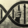
I think if the logo was turned sideways, looking like an infinity sign, it would look better. The infinity symbol would complement the concept of indefinite lifespans better. Also both lobes of the infinity symbol should contain the double helix strucutre. Also add a bit of a 3-D "twist" effect to make the dna double helix more visible and it would make the infinity sign look better.

Edited by FieldMarhsal, 13 April 2008 - 11:49 AM.


#2 Shepard

  • Member, Director, Moderator
  • 6,360 posts
  • 932
  • Location:Auburn, AL

Posted 13 April 2008 - 02:47 PM

Bruce discusses the logo here:

http://www.imminst.org/forum/index.php?sho...Institute\

#3 FieldMarshal

  • Topic Starter
  • Guest
  • 36 posts
  • 2
  • Location:California

Posted 13 April 2008 - 10:53 PM

I see, the 8 does mean infinity, but I didn't get that at first glance. An infinity sign would be a lot more striking viscerally.

btw, can someone post a picture of a sideways ImmInst logo so we know what it looks like? Then we'd have a more apt comparision of the two.

#4 FieldMarshal

  • Topic Starter
  • Guest
  • 36 posts
  • 2
  • Location:California

Posted 14 April 2008 - 04:12 AM

Attached File  Picture_6.gif   2.66KB   25 downloads

Here's what it'd look like

#5 forever freedom

  • Guest
  • 2,362 posts
  • 67

Posted 14 April 2008 - 04:19 AM

Yeah i think that an infinity logo would be really nice for imminst. I really think that the infinity symbol makes a good impact; that's why i have it as my avatar.

#6 jonano

  • Guest
  • 472 posts
  • 17
  • Location:Trois-Rivieres

Posted 20 April 2008 - 08:51 AM

I think this initiative is as useless, delusional and as not serious, as stupid as this:

http://en.wikipedia.org/wiki/Alex_Chiu

you guys have common goals, immortality, which is still the same aim. eternal cannot be real.

this forum is acting like a sect keeping its patient sick, stick on internet. You only promote internet addiction but for more stupid people than the alternative, which are more realistic since they dont debate on a subject already close.

#7 neonnexus

  • Guest
  • 51 posts
  • 1
  • Location:England

Posted 20 April 2008 - 09:01 AM

No, keep the logo vertical to retain the inverted hourglass symbolism.

#8 Shepard

  • Member, Director, Moderator
  • 6,360 posts
  • 932
  • Location:Auburn, AL

Posted 20 April 2008 - 04:07 PM

Also, these guys already use the infinity symbol:

http://www.fuckdeath.org/


1 user(s) are reading this topic

0 members, 1 guests, 0 anonymous users