• Log in with Facebook Log in with Twitter Log In with Google      Sign In    
  • Create Account
  LongeCity
              Advocacy & Research for Unlimited Lifespans


Adverts help to support the work of this non-profit organisation. To go ad-free join as a Member.


Photo
- - - - -

Simultaneous Worldwide Flyer Postings


  • Please log in to reply
219 replies to this topic

#31 Aegist

  • Topic Starter
  • Guest Shane
  • 1,416 posts
  • 0
  • Location:Sydney, Australia

Posted 23 February 2007 - 06:08 AM

Nice work guys.

I think we need to do our best not have the flyers come accross as commercial. You know, like so sort of infomercial.

we need to consider the shape of the actual flyer. If we deliver the flyer as a simple portrait A4 sitting on a wall it may not get peoples attention.

options:

1. Cutting an A3 sheet down the center to produce a long vertically rectangular or even horizontally rectangular.

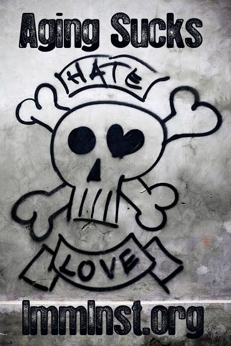
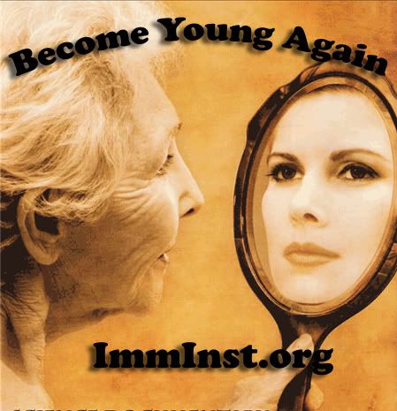
2. Something that go beyond the normal borders. For example, like the girls head in
this flyer. We could have someone swinging a large mallet/hammer, which extends beyond the border. The hammer of course will be just about to smash a clock of some sort.

These are just a few design options that we should explore.

So, IMO, we need to work on the following.

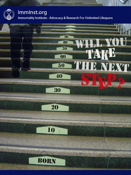
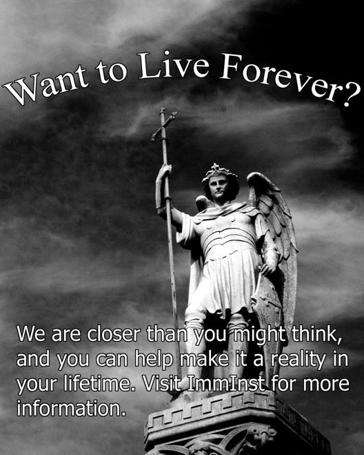
1. The initial attraction. What will make the person look at the flyer. In most situations an unusual design or striking graphic will bring someone in closer.
2. Once the reader has noticed and is looking at the flyer, I think we need to catch there interest will some strong science or an impressive statistic. Think about the effect an ad for cancer awareness has when it says....."1 in 3 people will die of cancer"
3. Accessability. The information needs to be accessible toa large majority of the readers. Our mission, the web URL and so on.....


Spot on Zoolander. This is exactly the sort of ideas I want to hear. The only thing I am committed to with this project is that we plaster these flyers all over the world, and they should have little tear off strips so people can take the URL home with them. Everything else is here for debate.

I think producing more interesting flyers would have a huge affect, and if it requires cutting out a shape with each flyer, then I think that would be a reasonable step to do. If each person who participates agree to make at least ten, then we aren't talking about much work each really. Its like 10 minutes work to make them all.

#32 Aegist

  • Topic Starter
  • Guest Shane
  • 1,416 posts
  • 0
  • Location:Sydney, Australia

Posted 23 February 2007 - 06:24 AM

http://www.allgraphi...igningtips.html
Some reading to help the design juices flow.

#33 Live Forever

  • Guest Recorder
  • 7,475 posts
  • 9
  • Location:Atlanta, GA USA

Posted 23 February 2007 - 06:51 AM

http://www.allgraphi...igningtips.html
Some reading to help the design juices flow.

No one get any of their juices on me, please.

sponsored ad

  • Advert

#34 Live Forever

  • Guest Recorder
  • 7,475 posts
  • 9
  • Location:Atlanta, GA USA

Posted 23 February 2007 - 09:45 AM

One thing to keep in mind is that if it is a full color one less people might print it out. (would be less inclined to use up their ink on it) Perhaps there can be a simple black and white one with just text and a full color one, so that people can choose the one they want?

#35 Aegist

  • Topic Starter
  • Guest Shane
  • 1,416 posts
  • 0
  • Location:Sydney, Australia

Posted 23 February 2007 - 10:40 AM

Absolutely. I expect to have up to 10 options for people to choose from in the end. And with specific reference to this problem, it makes sense to provide a black and white AND a colour version of each chosen flyer.

Second consideration is that we will need multiple languages. I actually want this to be done WORLDWIDE.

#36 eternaltraveler

  • Guest, Guardian
  • 6,471 posts
  • 155
  • Location:Silicon Valley, CA

Posted 23 February 2007 - 02:37 PM

should make a version(s) directed toward scientists and medical proffesionals with perhaps a bit more information. I could post them up around med school.

#37 zoolander

  • Guest
  • 4,724 posts
  • 55
  • Location:Melbourne, Australia

Posted 23 February 2007 - 03:08 PM

Here is my first try, which I did earlier today

Posted Image

and the second, which of course could be done in black and white. I used the wording from the front page.

Color

Posted Image

Black and white

Posted Image

I wouldn't mind getting some opinions and feedback. I tried to use image to set tone. For example, climbing the stairs is symbolic of the uphill battle. With each step there is a new challenge. In the second, I used a light bulb to symbolise life. Actually I like the second one. It's quite elegant and clean. The white light also gives the flyer a clinical feel

I'm not a graphic artist and do not work in advertising. I'm learning to use illustrator and Photoshop for the flyer design. What do people think? Is the approach to corny?

#38 mitkat

  • Guest
  • 1,948 posts
  • 13
  • Location:Toronto, Canada

Posted 23 February 2007 - 03:25 PM

No. I think we need some culture jammers. Culture jamming is a great way to slap people out of their formed views. For example, most people think that the will live and then die.


*Raises hand*

I'm on reading "break", and I'm going to try to think of some ideas.

#39 zoolander

  • Guest
  • 4,724 posts
  • 55
  • Location:Melbourne, Australia

Posted 23 February 2007 - 03:32 PM

Nice to hear dat Mitty <high five> Posted Image

#40 lightowl

  • Guest, F@H
  • 767 posts
  • 5
  • Location:Copenhagen, Denmark

Posted 23 February 2007 - 04:43 PM

Excellent work Zoolander. I especially like your first one with the stairs. Perhaps the first step could be labeled "birth" instead. I think that would work better, or it might just be me.

The ones with the lights are also good. The problem is just that printing those will take a lot of black inc or laser dust.

I will definitely print and post some flyers in various places. I think the main focus should be on life-extension and not Immortality. Or perhaps the target audience should determine the entry subject. I am planning to post on schools and libraries in my area. In lower age schools Immortality may grab more attention, but in libraries I think life-extension is a better initial message.

#41 lunarsolarpower

  • Guest
  • 1,323 posts
  • 53
  • Location:BC, Canada

Posted 23 February 2007 - 04:55 PM

My immediate idea:

Shorten the thing down to a curiosity generating URL. For example: something like slaythedragon.com

When they visit, have a flash animated storybook with the fable of the dragon tyrant. After reading through the story ~30 pages or so, the viewers are invited to whichever combination of anti-aging sites we decide on.

#42 Normal Dan

  • Guest
  • 112 posts
  • 12
  • Location:Idaho, USA, EARTH, Milky Way, 2006

Posted 23 February 2007 - 09:01 PM

In my experience, flyers work best when they have an image that is either pleasing or interesting to look at. An photo of landscape with several plants or majestic mountains or a young attractive female will draw eyes to theflyer. An intricate pattern or puzzle can keep eyes on the flyer long enough to get the viewer interested in looking further into it. The image on Live Forever's flyer has a bit of both qualities. Zoolander's flyer has the puzzle effect. Viewers will want to sit there for a bit to figure out what it means, then take a little longer to think about what it implies, then find themselves interested in whatever it is theflyer is advertising. Honestly I like Zoolander's flyer. It gets the point across while being vague enough to make the viewer want to know more.

As for distributing flyers, I for one would love to help. I plan on plastering them around the campus here and maybe some around town. I've been dying to find some goodimmortalists in or near Boise.

... my 2 cents

#43 Live Forever

  • Guest Recorder
  • 7,475 posts
  • 9
  • Location:Atlanta, GA USA

Posted 23 February 2007 - 09:04 PM

These aren't final designs, just some stuff I was messing around with (only took a few minutes). I scaled them down so they would fit on the screen, but they can be made to be full page or whatever size you want, and I was just putting random text in there, the text can be different.

I was thinking that there could be different designs for different demographics/areas of town that you hang them up.

For instance, for religious types (outside churches, etc):

Posted Image


For the street/punk/whatever demographic:

Posted Image


or, maybe:

Posted Image


And, for the afraid of dying demographic. (ok, so that should be everyone, haha):

Posted Image

#44 Shepard

  • Member, Director, Moderator
  • 6,360 posts
  • 932
  • Location:Auburn, AL

Posted 23 February 2007 - 11:05 PM

You can go for the sex angle and have an attractive woman..."Don't you always want her to look like this?" etc...

#45 basho

  • Guest
  • 774 posts
  • 1
  • Location:oʎʞoʇ

Posted 23 February 2007 - 11:43 PM

Posted Image

#46 zoolander

  • Guest
  • 4,724 posts
  • 55
  • Location:Melbourne, Australia

Posted 23 February 2007 - 11:51 PM

LF, nice work. I think it's going to be hard to get the younger, say skater/street demographic interested by making them think about their own age. They're young and full of life. We could make them think about their aging family? We need to use something that they can relate do. We need to do this with all of our target audiences.

#47 Aegist

  • Topic Starter
  • Guest Shane
  • 1,416 posts
  • 0
  • Location:Sydney, Australia

Posted 23 February 2007 - 11:52 PM

You guys are awesome. I love talented people.

Elrond made a good point about posting around Med school. We should design a range of the flyers to appeal to different categories of people.

Scientific approach for science departments at Uni.
Philosophical approach for arts departments at uni
Culture Jamming approach for the trendy parts of cities (I'll need this actually for my area)
Minimalist-curiosity styles for the common public

Any others?

#48 Aegist

  • Topic Starter
  • Guest Shane
  • 1,416 posts
  • 0
  • Location:Sydney, Australia

Posted 24 February 2007 - 12:00 AM

LF, nice work. I think it's going to be hard to get the younger, say skater/street demographic interested by making them think about their own age. They're young and full of life. We could make them think about their aging family? We need to use something that they can relate do. We need to do this with all of our target audiences.

LOL, the trouble there is that the 14-18 year olds who fit that category not only don't care about their own life, but typically hate their parents too. Makes it hard huh? :)

I think the best we can do is what LF has done, and just use images and concepts that they can relate to, and just hook them on the curiosity factor.

Ooooh... with the risk of being corny... a drugs angle may work. Mention the advances in 'drugs', but probably do it in a very subtle way so that they are left thinking 'wtf?'

#49 zoolander

  • Guest
  • 4,724 posts
  • 55
  • Location:Melbourne, Australia

Posted 24 February 2007 - 12:12 AM

Nice work Pete. The warning sign approach will always be an eye grabber. You use a warning sign generator right?

Just something I have learnt over the years. Your initial selling point i.e the poster, needs to sell the institute. If they see an image and think, something non institute, then what they read will be dissapointing and hence they will just ignore what they read. Therefore, the wrong image will most likely result in attracting people that are not interested in the first place.

These are some initial thought that you might want to jump into peoples head when they first see the flyer:

1. WE can stop aging? How? <---------------- Thought provoking
2. Don't have to Die <------------------------- Instill hope
3. Those stats are depressing <---------------Instill fear (a media favourite)

Wat about a tombstone that say

"should have logged onto imminst.org"

#50 Lazarus Long

  • Life Member, Guardian
  • 8,116 posts
  • 242
  • Location:Northern, Western Hemisphere of Earth, Usually of late, New York

Posted 24 February 2007 - 12:16 AM

Help us help you live forever

Try a few more in the affirmative mode too.

BTW great work folks I am very impressed.

#51 Lazarus Long

  • Life Member, Guardian
  • 8,116 posts
  • 242
  • Location:Northern, Western Hemisphere of Earth, Usually of late, New York

Posted 24 February 2007 - 12:19 AM

Also I think it is helpful when bringing the focus to the institute to encourage a sense of cooperative effort from the get go.

Imply a common cause and that we are providing the right direction for a mutual effort.

#52 Lazarus Long

  • Life Member, Guardian
  • 8,116 posts
  • 242
  • Location:Northern, Western Hemisphere of Earth, Usually of late, New York

Posted 24 February 2007 - 12:28 AM

BTW another marketing trick is to create a mystery about who the organization and subject is and feed that for a while before revealing who we are.

This creates a desire to know more about us that is a hook for them to check us out once they discover the access.

The first wave (or few) could be totally anonymous and simply begin to spread a meme and provoke interest and then later reveal our identity with an associated symbol that links the whole campaign and reinforce this with a local meeting, announcement for the journal, contest or something local that ties the interested parties to the local contact for more info. Another thing, I think we should use the logo somewhere, usually discretely or surreptitiously but with every poster and button. Think of it more as a watermark or trademark that later when it is revealed as our own emblem causes a triggered memory to the earlier thoughts and images.

#53 zoolander

  • Guest
  • 4,724 posts
  • 55
  • Location:Melbourne, Australia

Posted 24 February 2007 - 12:30 AM

We probably also have to be careful not to make generalisations about who we think we will attract with a certain type of flyer. We may be way off the mark

For example:

Attract Asian males

Posted Image

Asian Females:

Posted Image

#54 Lazarus Long

  • Life Member, Guardian
  • 8,116 posts
  • 242
  • Location:Northern, Western Hemisphere of Earth, Usually of late, New York

Posted 24 February 2007 - 12:35 AM

Correct Graeme.

BTW I meant just the logo not the whole banner. It is more subtle and flexible for creating messages over. Later however we can do exactly what you imply but treat the banner area as a text box for a more variable message and I suggest flipping the order and putting the name and slogan on top and the address below, with WWW. added.

www.ImmInst.org

#55 Aegist

  • Topic Starter
  • Guest Shane
  • 1,416 posts
  • 0
  • Location:Sydney, Australia

Posted 24 February 2007 - 12:35 AM

Wow Laz, you just gave me another idea. I love this cascade of ideas!

1. Yes, definitely agree with the logo. The hourglass logo is a brilliant graphical creation and should never be replaced, hence it should be used to firmly brand us into the minds of the public.

As a matter of fact, we could do one of those advertising campaigns where we just stick the emblem all over the place. Make a million stickers of the ImmInst logo and just start sticking them everywhere. We could start that now, and it will lead up to the flyer posting....

But that wasn't even my idea . What you said about keeping the organisation a mystery reminded my of Scientology actually. They do that a lot, particularly in personality tests. You do a personality test, and it isnt until the end that they tell you it that you need to go to scientology to get the results. Anyway, that reminded me of this: The death clock

If we could make our own death clock, and make that the landing page for some, then it puts the people in exactly the frame of mind of 'you are going to die'....'unless...' and then ofcourse link to a second landing page which reveals the progress we are making in the field, and how those results could be drastically changed before that terrible date comes.

#56 Live Forever

  • Guest Recorder
  • 7,475 posts
  • 9
  • Location:Atlanta, GA USA

Posted 24 February 2007 - 12:38 AM

Some more (just messin around):

Posted Image


Posted Image


Posted Image


Posted Image

#57 Lazarus Long

  • Life Member, Guardian
  • 8,116 posts
  • 242
  • Location:Northern, Western Hemisphere of Earth, Usually of late, New York

Posted 24 February 2007 - 12:40 AM

Yes Shane I was alluding to branding, which is the correct term to apply. We might apply for a trademark or copyright or what ever is required to protect the symbol from others coopting it.

I agree about the death clock somewhere on the front page too. That has been floated before and is appropriate to bring up prior to the software transition.

#58 Lazarus Long

  • Life Member, Guardian
  • 8,116 posts
  • 242
  • Location:Northern, Western Hemisphere of Earth, Usually of late, New York

Posted 24 February 2007 - 12:44 AM

I should also explain that I think the *www* needs to be back in the title because we here *in the web* assume too much about computer literacy and this is supposed to appeal beyond young folks and geek geezers like me.

The *www* prefix is more universally understood to make the name an address than just the period before *org.*

The address is easy enough to memorize or quickly jot down and making it obvious to those a little less familiar with the web is important; to reiterate Graeme's point about target subjects.

#59 zoolander

  • Guest
  • 4,724 posts
  • 55
  • Location:Melbourne, Australia

Posted 24 February 2007 - 12:48 AM

Combining the line you suggested

Help us help you live forever


with

Also I think it is helpful when bringing the focus to the institute to encourage a sense of cooperative effort from the get go.


Posted Image

I think the above flyer makes the point. On top of this it has an emotional and historical value don't you think?

#60 eternaltraveler

  • Guest, Guardian
  • 6,471 posts
  • 155
  • Location:Silicon Valley, CA

Posted 24 February 2007 - 12:49 AM

The address is easy enough to memorize or quickly jot down and making it obvious to those a little less familiar with the web is important; to reiterate Graeme's point about target subjects.


around universities shouldn't be an issue, but targeting other areas this is definitely something to keep in mind.


0 user(s) are reading this topic

0 members, 0 guests, 0 anonymous users